Soaring into the next century
The West Australian (liftout) – Friday October 1 1999
By Gary Stocks
West Coast Eagles have been an AFL benchmark almost since inception. Not only on the ground where they made the finals in only their second season, but off it as well.
After a solid on-field grounding the West Coast Eagles were doubtless the team of the 90’s, playing in the finals in each season, winning premierships in 1992 and 1994 and playing in the 1991 grand final as well.
Their success has been based around sound administration, stability and a preparedness to change with the times. Never has that been more evident than in the latest developments.
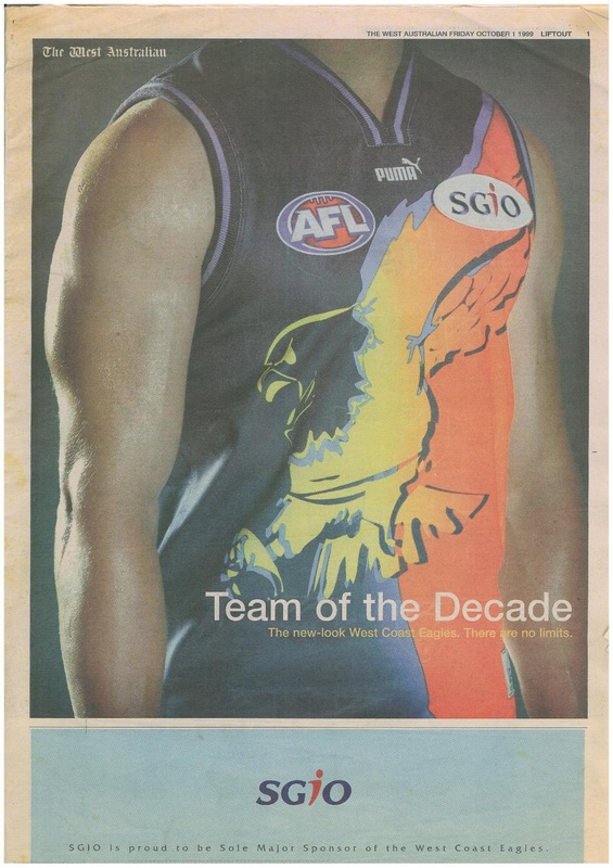
The West Coast Eagles have become one of the most identifiable sporting clubs in Australia, but the club is not content with that. It is looking at the world stage and that has been the genesis for a radical new design for the club’s away Guernsey – revealed for the first time at the West Coast club champion dinner last night at the Burswood theatre.
But that is only a small part of the story.
The club, after research, decided on the brilliant design that will also open up a myriad marketing and merchandising opportunities.
Marketing manager Ross Nicholas said it was always the plan of the club to up-date the guernsey.
“This season we had the same guernsey for home and away, but we had a different pre-season guernsey. It had been the plan for a couple of years that in 2000 we would actually have a new guernsey.
“We did quite a bit of research in junior schools, among the players, staff and officials.
“We then had Puma, our suppliers, and their international team of designers put together about 20 different designs. We narrowed that down to about six, took them around the schools and asked which one they liked.
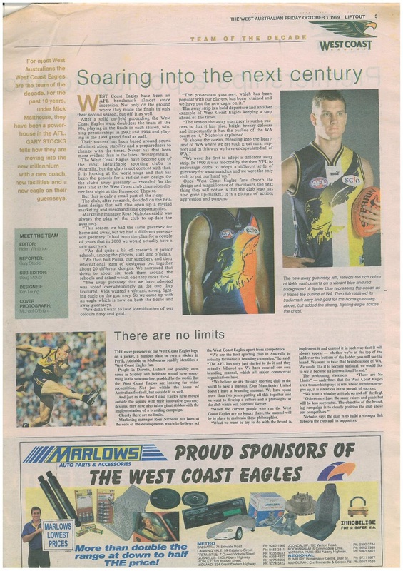
“The away guernsey that we have adopted was voted overwhelmingly as the one they favoured. Kids wanted a vibrant, strong fighting eagle on the guernsey. So we came up with an eagle which is now on both home and away guernseys.
“We didn’t want to lose identification of our colours navy and gold.
“The pre-season guernsey, which has been popular with our players, has been retained and we have put a new eagle on it.”
The away strip is a bold departure and another example of West Coast Eagles keeping a step ahead of the times.
“The reason the away guernsey is such a success is that it has nice, breezy colours and importantly it has the outline of the WA coast on it,” Nicholas explained.
“It shows the ocean, bleeding into the heartland of WA where we get such great rural support and in this way we have encapsulated all of WA.
“We were the first to adopt a different away strip. In 1990 it was mooted by the then VFL to encourage clubs to adopt a different style of guernsey for away matches and we were the only club to put our hand up.”
Once West Coast Eagles fans absorb the design and magnificence of its colours, the next thing they will notice is that the club logo has also gone up-market. It is a picture of action, aggression and purpose.
(pic caption) The new away guernsey, left, reflects the rich ochre of WA’s vast deserts on a vibrant blue and red background. A lighter blue represents the ocean as it traces the outline of WA. The club retained its trademark navy and gold for the home guernsey, above, but added the strong fighting eagle across the chest.
By Gary Stocks
West Coast Eagles have been an AFL benchmark almost since inception. Not only on the ground where they made the finals in only their second season, but off it as well.
After a solid on-field grounding the West Coast Eagles were doubtless the team of the 90’s, playing in the finals in each season, winning premierships in 1992 and 1994 and playing in the 1991 grand final as well.
Their success has been based around sound administration, stability and a preparedness to change with the times. Never has that been more evident than in the latest developments.
The West Coast Eagles have become one of the most identifiable sporting clubs in Australia, but the club is not content with that. It is looking at the world stage and that has been the genesis for a radical new design for the club’s away Guernsey – revealed for the first time at the West Coast club champion dinner last night at the Burswood theatre.
But that is only a small part of the story.
The club, after research, decided on the brilliant design that will also open up a myriad marketing and merchandising opportunities.
Marketing manager Ross Nicholas said it was always the plan of the club to up-date the guernsey.
“This season we had the same guernsey for home and away, but we had a different pre-season guernsey. It had been the plan for a couple of years that in 2000 we would actually have a new guernsey.
“We did quite a bit of research in junior schools, among the players, staff and officials.
“We then had Puma, our suppliers, and their international team of designers put together about 20 different designs. We narrowed that down to about six, took them around the schools and asked which one they liked.
“The away guernsey that we have adopted was voted overwhelmingly as the one they favoured. Kids wanted a vibrant, strong fighting eagle on the guernsey. So we came up with an eagle which is now on both home and away guernseys.
“We didn’t want to lose identification of our colours navy and gold.
“The pre-season guernsey, which has been popular with our players, has been retained and we have put a new eagle on it.”
The away strip is a bold departure and another example of West Coast Eagles keeping a step ahead of the times.
“The reason the away guernsey is such a success is that it has nice, breezy colours and importantly it has the outline of the WA coast on it,” Nicholas explained.
“It shows the ocean, bleeding into the heartland of WA where we get such great rural support and in this way we have encapsulated all of WA.
“We were the first to adopt a different away strip. In 1990 it was mooted by the then VFL to encourage clubs to adopt a different style of guernsey for away matches and we were the only club to put our hand up.”
Once West Coast Eagles fans absorb the design and magnificence of its colours, the next thing they will notice is that the club logo has also gone up-market. It is a picture of action, aggression and purpose.
(pic caption) The new away guernsey, left, reflects the rich ochre of WA’s vast deserts on a vibrant blue and red background. A lighter blue represents the ocean as it traces the outline of WA. The club retained its trademark navy and gold for the home guernsey, above, but added the strong fighting eagle across the chest.
